앱은 여러 화면들로 구성이 되어있는 경우가 많습니다.
화면들마다 색상을 구성해준다면 굉장히 불편하겠죠?
그렇기에 원하는 값으로 설정이 가능한 ThemeData를 사용하는 게
정신건강에 무척이나 좋을듯하네요 😁
class _MyHomeState extends State<MyHome> {

  @override
  Widget build(BuildContext context) {

    return Scaffold(

      appBar: AppBar(
        title: Text('Theme Data'),
        centerTitle: true,
      ),

      body: Center(
        child: Text('Body Text'),
      ),

      floatingActionButton: FloatingActionButton(
        child: Icon(Icons.add),
      ),
    );
  }
}
Scaffold 위젯에 기본적인 위젯들인 AppBar, Center-Text, FloationgActionButton로만 구성을 해놓았습니다.
ThemeData Class 살펴보기
ThemeData class - material library - Dart API
Defines the configuration of the overall visual Theme for a MaterialApp or a widget subtree within the app. The MaterialApp theme property can be used to configure the appearance of the entire app. Widget subtree's within an app can override the app's them
api.flutter.dev
위젯을 알아보기 위해서 공식 홈페이지 먼저 방문해야겠죠?
ThemeData class 문서를 살펴보니
MaterialApp의 'Theme' 속성은 앱의 전체 모습을 설정할 수 있다고 설명이 되어있어요.

ThemeData의 파라미터들이 나열되어 있습니다.

간단하게 primaryColor, body1, accentColor를 설정했을 때의 예시를 보여주고 있네요.
저도 각각 설정을 해볼게요.
MaterialApp
  @override
  Widget build(BuildContext context) {
    return MaterialApp(
      home: MyHome(),
      theme: ThemeData(
        primaryColor: Colors.red,
        accentColor: Colors.purple,
        textTheme: TextTheme(
          // bodyText2가 적용됨
            bodyText1: TextStyle(color: Colors.teal),
            bodyText2: TextStyle(color: Colors.yellow.shade800),
        ),
      ),
    );
  }

MaterialApp의 테마만 적용을 하고 위젯에서 style 속성을 따로 주지 않았을 때,
Scaffold의 매개변수 body의 인자 값인 Text위젯에 적용된 속성은 bodyText2의 값이었습니다.
TextTheme class 문서를 보니, bodyText2 매개변수가 기본 텍스트 스타일로 적용이 된다고 합니다.
따라서, 다수의 텍스트 스타일이 필요하지 않다면
기본으로 설정되는 bodyText2만 설정해주면 될 듯합니다.
다수의 텍스트 스타일 테마 정의하기
만약 여러 텍스트 스타일을 정의하고 싶다면?
이럴 때 여러 가지 텍스트 스타일 테마를 정의할 수 있도록
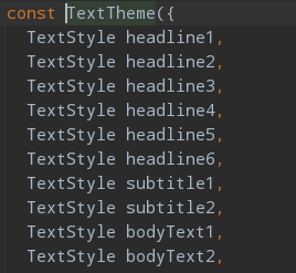
TextTheme 위젯은 다수의 매개변수들을 가지고 있습니다.
headline부터 subtitle, bodyText까지
여러 개의 스타일 적용해볼게요.
MaterialApp
  @override
  Widget build(BuildContext context) {
    return MaterialApp(
      home: MyHome(),
      theme: ThemeData(
        primaryColor: Colors.red,
        accentColor: Colors.purple,
        textTheme: TextTheme(
            bodyText1: TextStyle(color: Colors.teal, fontSize: 30),
            bodyText2: TextStyle(color: Colors.yellow.shade800, fontSize: 20),
            subtitle1: TextStyle(color: Colors.blue, fontSize: 50, fontWeight: FontWeight.bold),
        ),
      ),
    );
  }
subtitle1을 추가해주었습니다.
이제 각기 다른 텍스트 스타일을 Text 위젯들에다가 적용해줄게요.
Scaffold
 @override
  Widget build(BuildContext context) {
    return Scaffold(
      appBar: AppBar(
        title: Text('Theme Data'),
        centerTitle: true,
      ),
      body: Center(
        child: Column(
            mainAxisAlignment: MainAxisAlignment.center,
            children: <Widget>[
              Text(
                'Sub Title 1',
                style: Theme.of(context).textTheme.subtitle1,
              ),
              SizedBox(
                height: 10,
              ),
              Text(
                'Body Text1',
                style: Theme.of(context).textTheme.bodyText1,
              ),
              SizedBox(
                height: 10,
              ),
              Text(
                'Body Text2',
                style: Theme.of(context).textTheme.bodyText2,
              ),
            ]),
      ),
      floatingActionButton: FloatingActionButton(
        child: Icon(Icons.add),
      ),
    );
  }
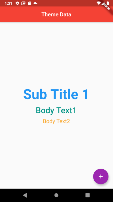
적용이 잘 되었네요.
설정해놓은 테마를 적용할 때는 Theme.of 메서드를 사용합니다.
Theme.of 메서드는 정적 메서드입니다.
가장 가까운 BuildContext의 상위에 명시되어있는 ThemeData의 값을 찾아서 반환하는 기능을 합니다.
여기까지 ThemeData 설명을 끝내겠습니다.
이대로 글을 마무리하기엔 아쉬우니 색상 속성을 살펴볼게요.
Material Design Color
Material Design
Build beautiful, usable products faster. Material Design is an adaptable system—backed by open-source code—that helps teams build high quality digital experiences.
material.io
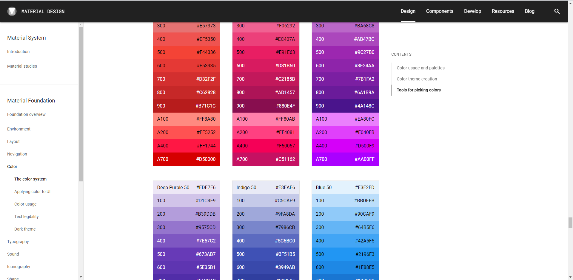
위 링크로 가시면 material 디자인 컬러 표를 볼 수 있습니다.
여기서 색상을 선정하셔도 좋고 더욱 세분화되어 나뉜 색상으로 설정하고 싶을 때는

두 메서드를 활용하시면 됩니다.
fromRGBO는 RGB 색상에 투명도를 설정할 수 있습니다.
테마에 지정한 색상들이 앱에 적용된 모습의 예시를 볼 수도 있습니다.
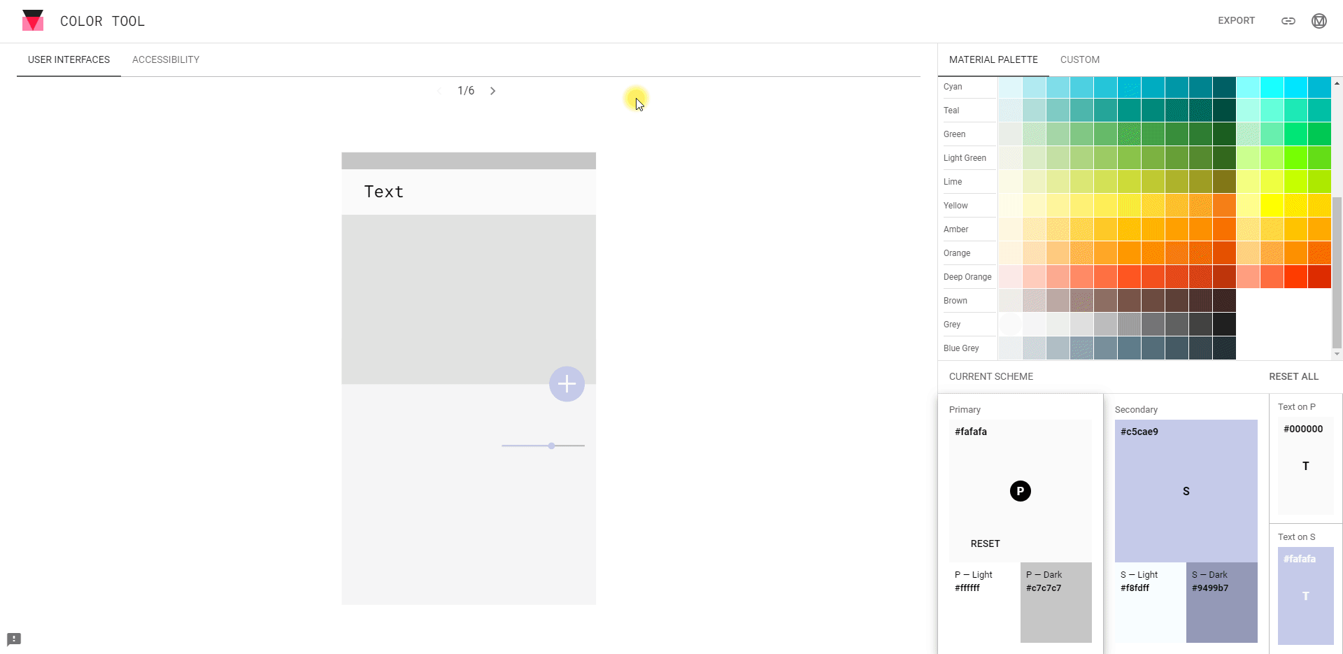
Color Tool - Material Design
Create and share color palettes for your UI, and measure the accessibility of any color combination.
material.io
위 사이트로 가면 material 디자인 색상뿐 아니라 좀 더 세밀하게 나누어진 색상으로도 설정할 수 있으며,
primaryColor, accentColor, button color, Text color까지 설정하여 테마가 적용된 앱을 확인할 수 있습니다.
'코딩 이야기 > Flutter' 카테고리의 다른 글
| [Flutter] Flutter 웹 release - Icon 엑박 이슈 (0) | 2021.01.16 |
|---|---|
| [Flutter] Flutter Web - Github Page를 통해 플러터 웹 호스팅 (1) | 2021.01.16 |
| [flutter] 화면 이동 구현 - Navigator (0) | 2020.12.07 |
| 웹에서 flutter 프로젝트 - flutter 온라인 IDE 추천 [flutLab] (1) | 2020.12.01 |